

The nuance between data and insights might seem small, but the difference is huge. Where data represents raw facts and observations, insights are the meaningful interpretations and understandings derived from analyzing and contextualizing that data.
Data is the foundation upon which insights are built. It’s the raw material, the vast sea of information that holds immense potential. And in that sea, the journey from data to insights requires careful navigation, analysis, and interpretation. It’s through this transformative process that data evolves into a stream of actionable insights, providing a deeper understanding and driving informed decision-making.
Having a straightforward data visualization platform plays a crucial role in improving data literacy within organizations. By visualizing the insights, complex concepts become more accessible, fostering a data-driven culture. Data scientists can develop a better understanding of data analysis, learn to interpret visualizations effectively, and become more proficient in extracting insights from data.
But why should we spend so much energy on the visualization process?
Visualizing data makes it easier to spot trends, patterns, and anomalies quickly. By presenting data visually, decision-makers can grasp complex information at a glance, enabling faster and more informed decision-making. Allowing for data-driven decisions that can drive growth and efficiency. Visualizations help convey a narrative and present data compellingly and persuasively. By combining the right text, images, and interactive elements, users can create engaging presentations that effectively communicate insights and findings to various stakeholders. Furthermore, offering real-time or near-real-time data monitoring and analysis, allows organizations to track key performance indicators (KPIs), monitor business metrics, and react promptly to changing conditions. Real-time visualizations enable proactive decision-making and help identify emerging trends or issues that require immediate attention.
This explains why the way we visualize the data is so important. Whether it is for monitoring performance, data analysis, decision-making, customer insights, collaboration, or communication purposes. The type of visualization plays a critical role in the design of a dashboard. It significantly impacts how data is perceived, understood, and acted upon.
Different visualization types offer unique ways of representing data. Whether it's bar charts, line charts, scatter plots, or maps, each visualization method presents data in a specific format. The choice of visualization should accurately depict the data attributes being analyzed. It should also ensure that the information is effectively conveyed to the users. Additionally, it should be influenced by the complexity of the data. Complex data, such as hierarchical structures or time series, may require specific visualization types that can handle the intricacies of the data. By aligning the visualization type with the data complexity, users can better understand the relationships, trends, and distributions within the data.
Different visualizations excel at emphasizing different aspects. Comparing quantities, showing trends over time, or identifying outliers. By carefully selecting the visualization type, designers can guide users' attention toward the intended insights. Users can then make informed decisions based on the data.
So what's one of the crucial mistakes people make?
A dashboard design should not have the end goal of simply being beautiful. That’s a nice bonus though. However, the end goal should always be to convey the information needed in a digestible manner.
A good example is the use of pie charts in modern dashboards. People often choose a pie chart for its remarkable design to visualize specific categories. However, a pie chart is not suitable for displaying a large number of categories or data points within one visual. It cannot effectively visualize a breakdown between 'some' categories. When there are too many slices in a pie chart, the chart becomes cluttered and visually confusing. It becomes difficult for users to distinguish between the smaller slices. Using a different visualization, such as a bar chart or a stacked column chart, can better represent the information. These charts can accommodate more categories and provide clearer comparisons.
Another example could be the color selections, such as using conflicting or overly bright colors, which can make it difficult to read or interpret the information. Colors should be chosen carefully to ensure readability, contrast, and accessibility for all users.
Aside from the initial need to make a dashboard appealing, there can be other mistakes. Quite often, the need to offer contextual information and answer all the questions to stakeholders conflicts with a cluttered dashboard. Furthermore, the dashboard can lose its hierarchical structure.
What does the backend look like?
Huge sets of data, a lot of different stakeholders, a lot of different questions that are being asked, and a lot of different insights that are required. Setting this up on the backend is not easy especially when dealing with versatile data that caters to different domains and use cases. The main challenges in constructing business intelligence (BI) visualizations typically revolve around:
- Ensuring the data structures are designed specifically for analytical purposes.
- Providing connectors/APIs for querying and accessing the analytical data.
- Developing UI widgets capable of visualizing data in various styles.
- Being able to swiftly update and enhance visualizations based on customer feedback.
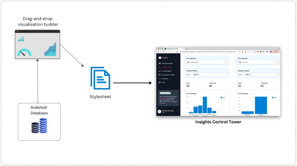
At Sentiance, we have addressed the challenge of creating impactful visualizations by eliminating the need for separate connectors/APIs (point 2) and UI widgets (point 3). Instead, we have introduced a drag-and-drop interface (powered by cumul.io) that empowers our data scientists and analysts to directly create dashboards. These dashboards can be seamlessly embedded into our web application, Insights Control Tower.
Our underlying stack can be broadly categorized into the following components:
Alright, so what does this all mean?
In conclusion, moving from data to insights requires thoughtful consideration of visualization types, data complexity, user understanding, and the overall context of the dashboard. It's not merely a matter of presenting data visually. It involves the careful selection of appropriate visualization methods that effectively communicate the intended message and reveal hidden patterns and trends. The design process must also address technical challenges, such as data integration and processing, ensuring the dashboard's feasibility and scalability.
Ultimately, the attention given to dashboard design is what enables the transformation of data into actionable knowledge. It empowers users to harness the full potential of their data assets. With its latest addition, Sentiance’s Insights Control Tower (ICT) allows our clients to identify the right types of data, for the correct purpose, with the correct scaled backend in place.


